 Also available to buy in a beautiful limited edition paperback and eBook.
This work is licensed under a Creative Commons Attribution 4.0 International License.
If interaction design is the brain of the interface, graphic design is the heart and soul. The visual design of an app is more than a superficial layer: good design guides the user by communicating purpose and priority. For that reason, every part of the design should be based on an informed decision rather than an arbitrary result of personal taste or the current trend.
Design begins as a blank space, into which shapes of various sizes are positioned. Web designers have little control over the format of the space since the dimensions are constrained by the users’ screen resolutions, but they retain control over the fundamentals of composition: size, position and the spatial relationship between elements.
A shape placed into a blank space establishes a relationship between its position and the edges of the space.
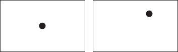
If the shape is positioned centrally, the space will appear neutral, balanced and a little sterile. Moving the shape off-centre creates tension, adding interest for the viewer and encouraging further exploration.
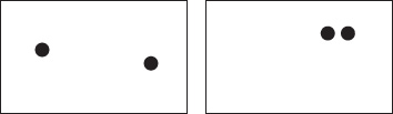
When multiple shapes are incorporated, the spatial relationship and interaction of the shapes becomes the primary focus of the design.
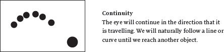
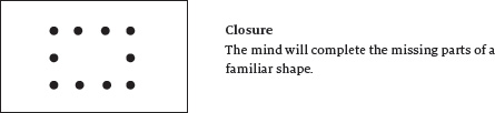
In the 1920s, German Gestalt1 psychologists proposed theories to explain how we organise and group individual visual elements into a unified whole. These principles are useful for describing the fundamental rules of composition.
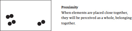
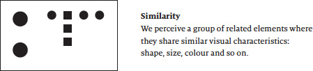
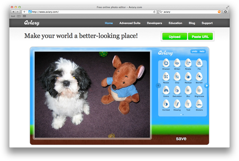
Aviary2 uses the Gestalt principles of proximity and similarity to identify menus and features with different uses
Negative space, commonly referred to as white space, is the area of the design not occupied by compositional elements. Gestalt theory has a name for this too: it is the ground, and the main compositional elements are the figure.
Negative space is not necessarily white or empty space – it might contain colour or texture – but it is non-distracting space that our mind perceives to be the background or gaps between elements.
It is important to design the negative space as you would the compositional elements. Shape and group it so that it becomes an active part of the design: supporting the main elements, providing a resting space for the eye and assuming an attractive aesthetic in its own right.
Group and simplify white space to improve composition
Negative space can be used to draw attention to important areas of the page. Look at any Apple product website or advert and you’ll notice how they surround the primary product with ample white space. Even so, the quality of the space is usually more important than the quantity: ensure that your negative space is aligned, distributed and sized consistently and with consideration.
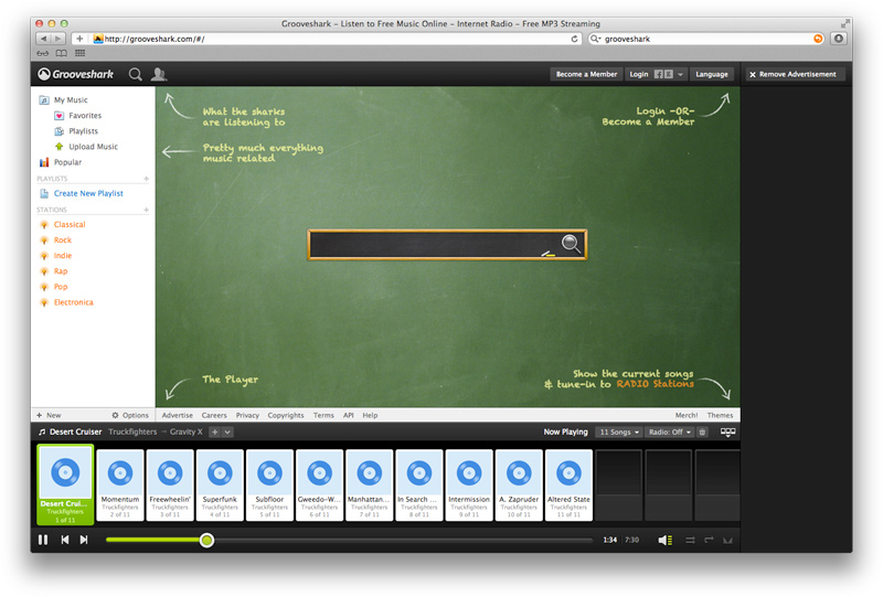
Grooveshark3 uses white space to highlight the important starting point in an otherwise potentially confusing interface
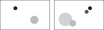
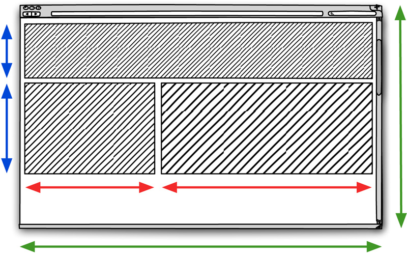
The size and position of elements in a composition will determine its balance. An unbalanced design generates tension, which may be the goal in many design projects, but for web apps that demand repeated comfortable use, tension is not a desirable trait.
Similar to physical objects pushing down on a sheet of paper, the balance of design elements on screen is dictated by weight, not size alone. The darker or more vivid a colour, the heavier it is: a large, lightly coloured object can be balanced with a smaller, darker object.
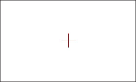
Note that people perceive the centre of a composition and, therefore, the natural balance point, to be slightly above and to the right of the mathematical centre. This visual centre is the natural position of our focus, where our eyes tend to dwell.
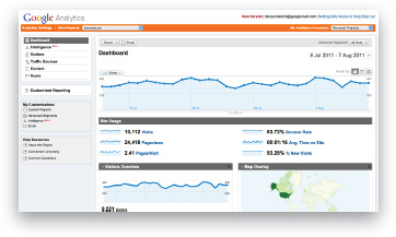
The main right column of Google Analytics has a white background and is balanced by a narrower but darker column on the left.
We can use the visual weight of objects on a page to guide the user through a predetermined story, controlling the order in which they view parts of the design as a means to improve their comprehension.
The story starts at the heaviest object (normally the largest and darkest), and proceeds down the weights, resulting in the action that you need them to take for the task.
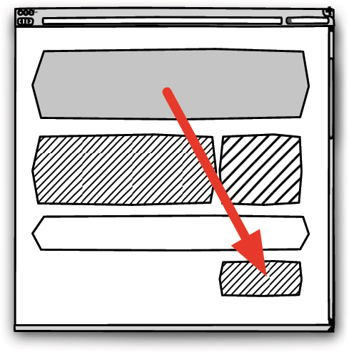
Guide the flow of the eye with a visual hierarchy
Without a visual hierarchy, the user has no context about where to start or end, and may skip an important step or information that results in an error.
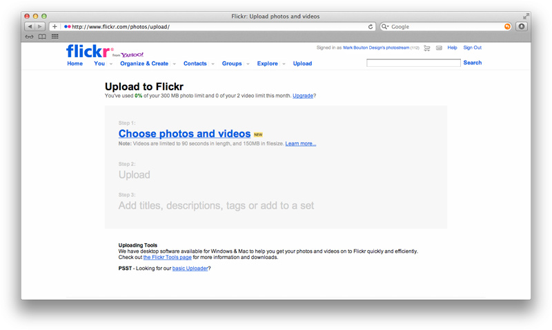
The Flickr upload screen uses a strong, dynamic visual hierarchy to support the user task
Combined with the principles of interaction design discussed in the previous chapter, these theories of space, balance and hierarchy can be used to choose approximate relative sizes and positions for the visual components of your web app.
Now let’s add some detail to the measurements.
“…these rhythms are at the very root of human activities. They resound in man by an organic inevitability, the same fine inevitability which causes the tracing out of the Golden Section by children, old men, savages and the learned.”
Architect and designer, Le Corbusier4
The golden ratio, also known as the golden section or the golden mean, is a proportional system derived from geometry that has been studied since the time of the ancient Greeks5. Many artists and philosophers consider proportions defined by the golden ratio to be aesthetically pleasing. One academic suggests that this is because we have evolved to more easily interpret images that feature the golden ratio6.
The golden ratio has been used three times in this layout
The only thing you really need to know about the golden ratio is the following number, which is referred to as phi or φ:
1.618 … (the digits continue forever, but this is accurate enough for us)
If you take any number and multiply or divide it by phi, the new number and the original number will form the golden ratio.
For example, a rectangle of 400 pixels width will conform to the golden ratio when placed next to a rectangle of 647 or 247 pixels width. Additionally, these measurements can be used for both dimensions of a single element: a 400×647 rectangle and a 400×247 rectangle both conform to the golden ratio.
If you have a total width that you need to divide into two proportional parts, that’s simple too: divide the width by phi to get the first measurement, and then either divide that measurement by phi or subtract it from the initial width to get the second. For example, to split 960 pixels by the golden ratio:
Measurement 1: 960÷1.618 = 593px
Measurement 2: 593÷1.618 = 367px or 960−593 = 367px
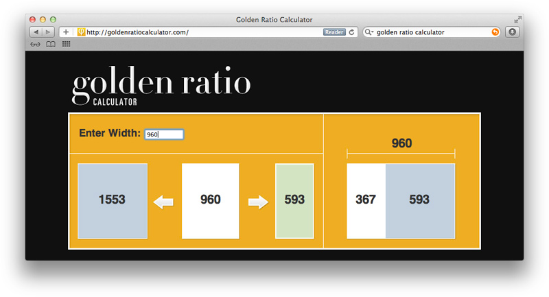
As you might expect, someone has built a web app to simplify golden ratio calculations: http://goldenratiocalculator.com
The golden ratio is a useful tool for both macro-proportions (such as the widths of a two-column layout) and micro-proportions (like the composition of an image), but the irregular 1.618 divisions can become laborious and increasingly complex if used for multiple elements on a page. We need something simpler.
You can think of the rule of thirds as a simplification of the golden ratio. It has an equally impressive history in the composition of art, photography and design. The rule is applied when a space is divided into thirds by imaginary horizontal and vertical lines and then elements are placed at the intersection of these lines in order to pique the viewer’s interest.
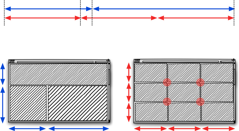
A comparison of the golden ratio (in blue) and the rule of thirds (in red)
It may be a simple rule but it, too, is difficult to apply to web app design. Photographs and printed materials have fixed dimensions that can be easily divided into thirds. Although websites often have fixed widths, the visible vertical dimension of a website will depend on the screen resolution of the user’s display, making a fixed vertical division virtually impossible (unless the design is very small and likely to fit vertically into most resolutions).
The rule of thirds is tricky for web app design
What we really need is a composition system that offers sufficient constraints to guide proportions and alignment of the design but enough flexibility to work on the web and allow some creativity.
The rule of thirds and golden section essentially define grids of specific, well-known proportions. Other grids might not boast accepted aesthetic points of interest but they do establish skeletal compositional frameworks that yield consistent, clear and efficient designs.
Column grids divide the page into vertical columns, usually of the same width or multiples of a base width. A gutter space is incorporated between columns and a margin separates the boundaries of the grid from the edge of the page
.Elements of the design (text, images, logos, white space) needn’t be forced into single columns, but should be sized to occupy a whole number of column widths.
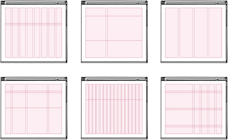
Grid systems come in a variety of shapes and sizes
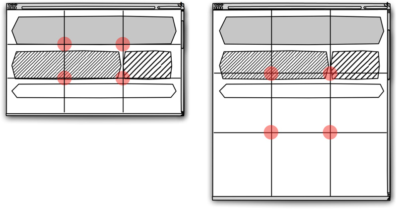
Horizontal flowlines may be included to add further structure and consistency to grids. These might define the distance from the top of the page where the main heading is positioned or the vertical location of a side menu.

Anatomy of a modular grid system
If many flowlines are defined so that the page is divided into consistent columns and rows, the grid becomes modular. This creates a matrix of rectangular pieces referred to as modules.
Multiple adjacent modules may be grouped into spatial zones. Each zone can be assigned a role: a zone for a menu or submenu, a flow of text, an advert, an image, or a consistent location for contextual help. Although the base grid of columns and rows should not change from page to page, the zones on each page can vary.
The size of the grid modules should be based on the most important content of the app.
If your app relies on advertising for revenue, the advert dimensions might be important enough to influence the grid dimensions.
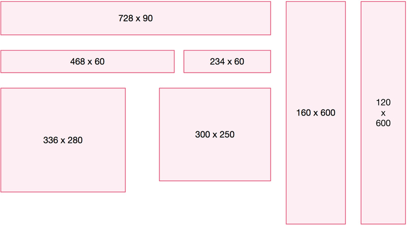
Some commonly used advert dimensions
For example, you could set the vertical columns at 84 pixels width with a 12 pixel gutter, which would accommodate a 468×60 banner across a zone of five columns (remember to include only four gutter widths if you’re double-checking my calculations). Alternatively, a column width of 96 pixels with a gutter of 24 pixels could display a 336×280 banner across three columns (and two gutters).
If your app concentrates on textual content you could establish the grid from optimum readability conventions and the average paragraph length. A good rule of thumb is to set text at 12 words per line, which equates to about 420 pixels width at default browser text sizes7. A column width of 120px combined with a gutter of 30px would support text well across a zone of three columns.
Similarly, if your app is designed for photos, use standard digital photo sizes and ratios to build your grid. If your app displays graphs and charts, calculate the size they need to be for optimum legibility and use that as the basis for your grid calculations.
A final note on grid measurements: a margin that is larger than the gutter will help to guide the eye inward. Try setting the margin at twice the gutter width and experiment from there.
Although this chapter discusses grid measurements in pixel units, it is equally valid – and increasingly advantageous – to define grid columns as percentages or a hybrid of percentages and fixed widths. This enables your app design to better adapt to variations in device displays and screen sizes. If you decide to use percentage-based columns, it is prudent to set a minimum and maximum size for the total grid width to avoid extremely narrow or wide columns of unreadable text.
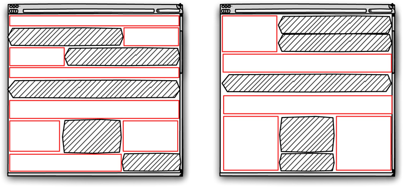
Grids are particularly suitable for web app design where repeated, practical operation of the app demands clarity and consistency over shock-and-awe design. Even so, you may need to occasionally emphasise a part of the page, such as an important item in a list, or an error message. You can grab additional attention by breaking the rules: shifting an element off the grid.
An element shifted off the grid will rise to the top of the visual hierarchy and become the first stop for the user’s eye.
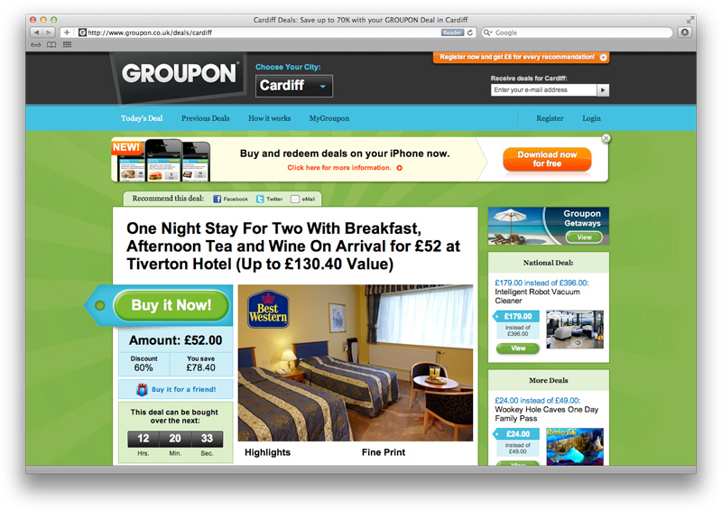
Groupon breaks the grid for the most important element on the page: Buy
Violations of the grid must be small and infrequent, so that the inconsistency with the underlying grid is noticeable. Breaking the grid sparingly for important information is a useful technique for increasing usability, but be careful not to overuse it on insignificant elements for visual interest alone at the expense of usability.
Design the proportions, layout and style of interface elements to guide the eye through tasks.
This work is licensed under a Creative Commons Attribution 4.0 International License.